Color, Color system, Corporate, Corporate design, Information architecture, Product design, trade show
Booth design (orange)
17. Februar 2013
On shows, you have to stand out. Some time ago we visited some of the major shows, connected to our clients, and industrial sector.
What we found out was, that many, more than 50% of competitors boths on trade fairs, and on scientific events, used blue as the key color of their appearance.
This goes hand in hand with the research you can find in „Marketing mit Farben“ (Marketing with colors), Erich Küthe, Fabian Küthe: Marketing mit Farben: Gelb wie der Frosch.
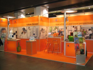
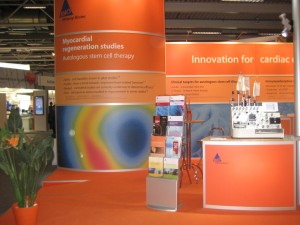
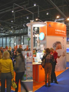
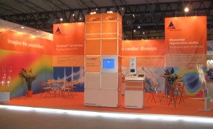
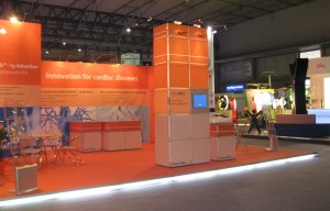
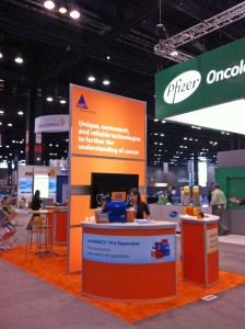
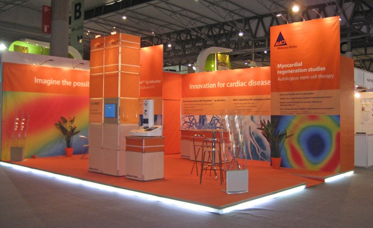
To have a prominent, warm appearance, and an outstanding poition we choosed orange as the major color for our appearance on trade shows and fairs. It works well, as you can see.
Extremely helpful ist the combination of handmade installations (usually done locally, by local suppliers worldwide), and the system components of Burkhardt Leitner constructiv (http://www.burkhardtleitner.de/), which we are able to design and handle with a perfect support by Schirwon Messekonzepte from Cologne (thanks tot he company) (http://www.schirwon-messekonzepte.de).
Schlagwörter: Color, Corporate, design, exhibition, information architecture, Print, product
© 2025 Chris Schubert | Eleven Themes

