Wrangler Europe, website for the brand

13. Januar 2002

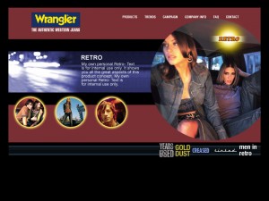
Another section page for Retro style. Some things never change.

Another section page for Retro style. Some things never change.

The Wrangler website had to follow the actual campaign (we used thepictures), which ran fine with the diary of the protagonist. The size finder tool ran on flash. And some movies did, too. If we had twitter in 2002 – it would have been perfect, same for foursquare. Or Vine.

Today, some of the things we did in the beginning of the millenium weren’t too bad. I liked the hot-or-not stuff.


We tried to build everything in flash, sometimes this really worked fine.
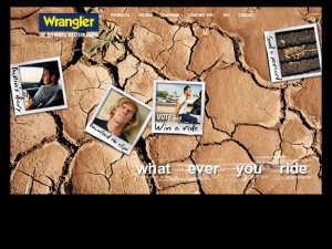
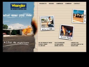
The original planned start page. With the original slogan. Whatever you ride. True.

The original planned start page. With the original slogan. Whatever you ride. True.

The brand decision website.

The brand decision website.

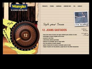
This was a page showing one of the product sectors

This was a page showing one of the product sectors

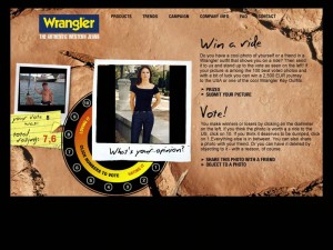
We added a feature which became popular in 2001: Hot or not – with pictures, uploaded by users wearing a wrangler jeans.
We added a feature which became popular in 2001: Hot or not – with pictures, uploaded by users wearing a wrangler jeans.

The size, style, fit could be choosen, to see the selected model in the end

The size, style, fit could be choosen, to see the selected model in the end

Another section page for Retro style. Some things never change.

Another section page for Retro style. Some things never change.

The burning house was a burning flash video.

The burning house was a burning flash video.

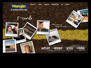
Also this was popular in 2002: E-Cards to be sent via web. What I want to say: It was the past, even in 2002. But we had to embed the feature.

Also this was popular in 2002: E-Cards to be sent via web. What I want to say: It was the past, even in 2002. But we had to embed the feature.

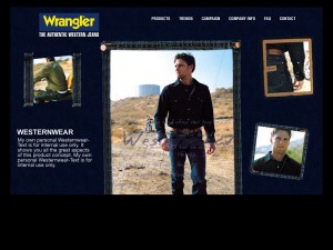
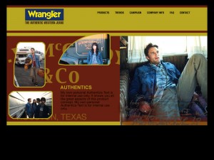
Authentic style section.

Authentic style section.

Schlagwörter: , , , , , ,