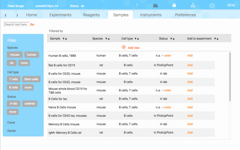
Interface for complex interactions on research instruments
16. Juli 2017
A complex interface is a relative term. The context and know-how of the user, and the task which has to be done makes it so. More important seems to find out, “… what is the least complex interface you can design that allows your user to operate at their level of proficiency?” (ux . stackexchange . com / questions / 55240)
We are not trying to build complex interfaces. We are not even allowed to do so. And in cases, where complex interfaces are necessary to make a the human-machine-interaction possible, we have the fascinating job to make this – the UX, and the interface, as easy as possible.
When we perform well, a complex interface helps to do a job with ease, fun, and the feeling of simplicity for all users, who are familiar with the domain of a complex performance. As UX designers we have to avoid unnecessary elements, and make important elements easy to find.
As mentioned at ux . stackexchange . com / questions / 55240: “A design that does not adequately take into account the users‘ abilities within the problem space and/or does not remove complexity where it is not essential will be perceived as „complex“ or „difficult to use“. It is only your user, through user testing, that can tell you if the design is too complex for them.”
© 2026 Chris Schubert | Eleven Themes
