Choosing the best colors (by using a semantic differential)
17. März 2010
Generation of a color system by using a semantic differential
The major problem of building a color system is translation. The most common situation is that products, brands, architecture, or guiding systems have a clear target: to sell, to impress, to inform, to help. These goals are usually set by the CEO. By the president. By the owner.
For such targets color is a strong tool which works well, for example, in helping survive when crossing a street: Red simply means „Stop!“. At least on a traffic light.
But which color means: „Buy me?“ Or, which color combination stands for „I’m a stable and reliable product“?
Some colors represent special feelings.
As usually, the product development team and the engineering department have given their best to build the technically perfect product, and the next crucial question goes to marketing: „How to convince the potential consumer?“
What the marketing professionals should know, and what they are asked: What arguments are necessary, strong and effective? Which impression should be received, what mark should be left? After generating a description in words (e.g., our product is modern, is fast, is powerful, and reliable, but not cheap) the whole package is handed over to – graphics.
„Help us. Translate the message into an overall picture. Choose the right font, color, motif, and… and – translate.“
In the end, it is not to easy to find a way to design. And it is not easy to convince the CEO, the owner, the president, that this is well done. His wife likes pink. But his mother has never bought anything in pink bags. And, as his neighbor has a white car, white as a color stands for poor and stupid people.

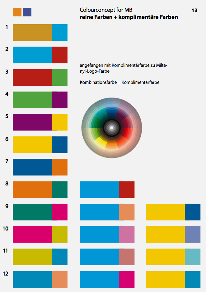
When it comes to choosing colors, and to make a long story short: In order to cut this Gordian knot, one can use a semantic differential as a translational tool.
How does this work? Pairs of attributes are defined, which build pairs of contrary meaning, but both parts of the pairs are positive (this is essential!). For example, „innovative and equipped with modern technique“ versus „old and proven and familiar“. Both sounds good, but new inventions cannot be proven and familiar, well-established goods cannot be innovative.
Between this antipodes a scaling is to be done, preferably with an uneven number of choices to leave the chance for indifferent votes.
The challenge then is to decide for each pair of attributes: What do I want to have?
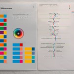
A color scheme (left), and a semantic differential to evaluate colors. Profile is shown in the graph – red is target, blue the actual scheme.
You see here one color system draft, with semantic differential – the wanted and the reached values (this was a good one).
„Easy, light in color and in weight“ or „solid, stable, heavy and darker“. And similar decisions. This can be sorted out for music, for products, for people. And for colors. And by using this translational help, the results are easy to check, free of personal belief, and easy to prove.
We did the crosscheck by asking several people this question. Sometimes this brought up a discussion (which was helpful), for example, if the product is more solid or more detailed and filigree.
Sometimes no concordance was possible. But in many cases all agreed. And had a tool to check: Is it this what we decided to aim at? Is it what we really wanted? In many cases it wasn’t what we liked most, but the results showed us what could really fulfil the defined needs.
© 2024 Chris Schubert | Eleven Themes